
Good Morning, in my daily reading I came across this link posted on Harvey's blog. As I have been saying to anyone who would listen we are living in a time of exaggerated deception or perhaps I'm naive and its been same throughout history of this nation.
When I was growing up we had just CBS, NBC and ABC and of course the newspapers. So we had only those voices, and their freedom of expression that was the only way to communicate effectively to the masses. Now via, the net (Blogs) "We the people have a voice", a very loud one at that. And we need not gather in the streets, but share thoughts right here.
Do not be confused by the disinformation being fed to you: DON'T GET FOOLED AGAIN!
TECH BUBBLE, HOUSING BUBBLE, SUB-PRIME, FINANCIAL CRISIS: Brought to you by the FED (cartoon shows you in a light-hearted how the central banks came to be and how they control government)
"If the American people ever allow private banks to control the issue of their currency, first by inflation, then by deflation, the banks and corporations that will grow up around them will deprive the people of all property until their children wake up homeless on the continent their Fathers conquered...I believe that banking institutions are more dangerous to our liberties than standing armies... The issuing power should be taken from the banks and restored to the people, to whom it properly belongs."~Thomas Jefferson
Brilliant post by, Jeff Nielson (www.bullionbullscanada.com) :
When their reporting excludes 85% of the U.S. economy, it obviously becomes very easy to "stack the deck". As an easy example: the U.S. is (still) embroiled in two (and now three?) "wars". With the biggest war-machine in the history of the world, certainly more than 1/6th of the U.S. economy is devoted to simply servicing that war-machine.
Thus all that ADP Employment Services needed to do to create a "U.S. economic recovery" is to focus its reporting on U.S. companies which derive a substantial part of their revenues from the U.S. military - a very long list. Having established that this data-stream could have easily been skewed to the point of total irrelevance, the question then becomes: is there evidence of such fabrication?
Fortunately, there remain a few niches of data reporting in the U.S. economy which have not yet been completely "sterilized" by the U.S. government's propaganda-machine. When such data is depicted in the form of long-term charts, those charts paint an irrefutable picture of an economy mired not merely in a "recession", but one which is clearly experiencing a depression.
Let's start with the one measurement of the U.S. unemployment rate which is still in the same ballpark as real-world numbers: the "U6" measurement.
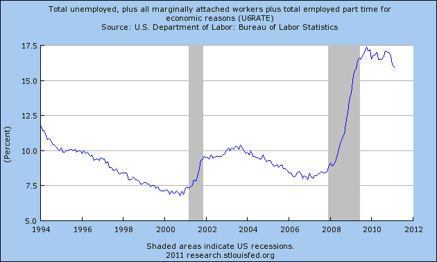
First let's look at the overall level. Current U.S. unemployment is about 16% - nearly double what the U.S. government pretends it to be. Note the tiny improvement from the worst level. The roughly 1% decline in this rate takes it back to where it was when the U.S. government claimed that the U.S. economy had "hit bottom".
Let me reiterate this: after two years of a supposed "economic recovery", even using the U.S. government's own data, we see that the unemployment rate has merely equaled the rate at the "bottom" of the so-called recession. Two years of supposed "job creation" has brought the U.S. economy to the same point it was at the so-called "bottom". Using the U.S. government's own data, there clearly never was a "recovery".
Let's move on to a few more pictures on U.S. employment/unemployment. If we look at "long-term unemployment" in the U.S., we see a chart much like the "U6" unemployment rate.
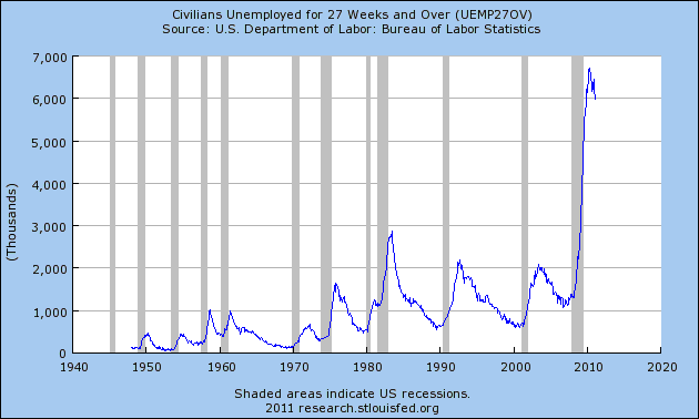
After two years of a supposed "economic recovery", we see U.S. long-term unemployment much, much worse than at any time since the Great Depression - and no indication of any "recovery".
Equally revealing is a chart on the employment "participation rate" among the U.S. population. As with all Western countries, we see a large climb in this figure which began moving significantly higher in the 1970's, reflecting the integration of large numbers of female workers into our economies.
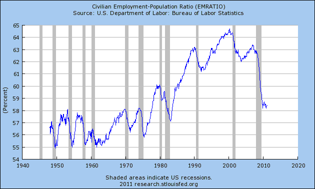
As with many U.S. economic charts, this one "fell off a cliff" when the U.S. Greater Depression began in 2008, and despite two years of an "economic recovery", there has been absolutely no recovery. Participation rates have reverted to what was seen in the U.S. prior to the massive increase in female employment. The U.S. now has both genders wanting to work in an economy which is only supplying enough jobs for one gender.
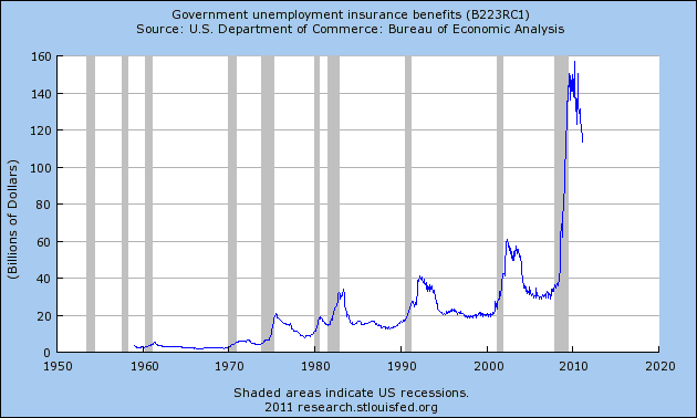
The last of these employment charts shows the massive spike in the payment of unemployment benefits. Again we see a chart which duplicates the pattern seen in the other charts, but which is derived from a totally separate data-stream. The modest "improvement" here is derived solely from the expiration of benefits, and not from rising employment levels - and even after this "improvement", payment levels are worse than at any time in the U.S. in recorded history.
The only conclusion which can be drawn from the clear picture presented in these charts is that there has never been any "U.S. economic recovery", meaning that the ADP payroll-reports have become nothing but totally fictitious government propaganda (much like the BLS B.S.).
Naturally there will remain a large number of trusting 'sheep' out there, who steadfastly believe that their government would never lie to them, and thus are convinced I must be "cherry picking" my numbers in some sort of devious manner. My apologies to readers who have already seen the following chart a few times, but it provides the clearest picture of all.
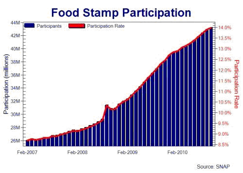
As I pointed out previously, the tiny little "blip" indicates roughly when the U.S. government claims that the U.S. economy bottomed, while the steady climb in food stamp-usage since that time reflects the supposed "economic recovery". As with all of the employment charts, it is obvious that such a recovery never took place.
Like "The Boy Who Cried Wolf", the U.S. government has been lying about its employment data so much for so long, that even in the unlikely event that the U.S. economy did actually begin to produce positive employment gains, it's unlikely that any thinking adult will believe it.
The U.S. economy is mired in a worsening depression. Yet what is even more depressing is that the only "solution" which the U.S. government has come up with to deal with this economic catastrophe is to tell larger and larger lies. As the chart on food stamps clearly demonstrates, those lies are not putting food on the table for Americans.
No comments:
Post a Comment